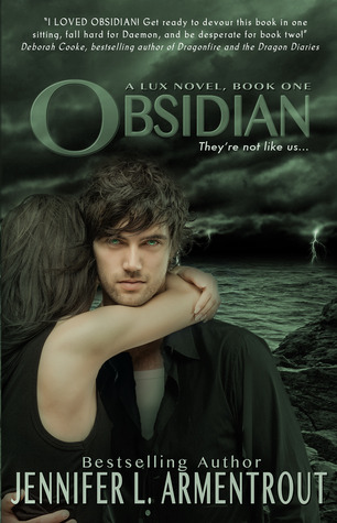
Lux Series by Jennifer L. Armentrout
 Published: November 29th, 2011 - August 5th, 2014
Series Length: 5 books
[Obsidian | Onyx | Opal | Origin | Opposition]
Genre: Science Fiction
Average Page Count: 396 pages
Not gonna lie, I held off on this series because the covers were so off-putting. They look like cheap romance novels. There was a cover change towards the end but I can't say those looked much better. I will say the cover change was a bit more reminiscent of their alien nature but it was still very cringe. The Lux series is well worth your time so if you can get it in an ebook format that would be ideal. Just until they come up with some better covers.
The Chemical Garden Series by Lauren Destefano
 Published: March 22nd, 2011- February 12th, 2013
Series Length: 3 books
[Wither | Fever | Sever]
Genre: Dystopian
Average Page Count: 356.67 pages
The Chemical Garden series was not one that immediately jumped out to me when I started brainstorming books I enjoyed with bad covers because at the time, I didn't think these covers were terrible at all. They were science fiction/dystopian-looking enough to be passable but looking back on them now it just looks like a lot. I guess they were a product of their time. It was mid-high school. My taste in covers weren't the most sound in high school but thankfully my taste in the contents of the books I read was. This series made Lauren Destefano one of my favorite authors.
Evernight Series by Claudia Gray
 Published: May 27th, 2008 - January 1st, 2012
Series Length: 5 books
[Evernight | Stargazer | Hourglass | Afterlife | Blathazar]
Genre: Fantasy
Average Page Count: 345.8 pages
Even years later I still think about this series. That's a pretty good indicator of the kind of story this is. It's certainly good enough to excuse the covers. If you were a cover designer asked yourself, "What would convey vampires to the reader?" Would the answer be that? I mean, I guess it's kinda mysterious but definitely not vampires nor a school for vampires. I personally find them a little uncomfortable to look at maybe because they're so close to the face? I mean, once you get reading you won't be looking at the cover much anyway so you may as well take the plunge.
Elemental Series by Brigid Kemmerer
Published: April 24th, 2012 - September 30th, 2014Series Length: 5 books
[Storm | Spark | Spirit | Secret | Sacrifice]
Genre: Fantasy
Average Page Count: 346 pages
I'm sure I've discussed the Elemental series on xo, Yvette before but I can't leave out the very series that inspired this blog post. I'm still obsessed with this series and the Merrick brothers (there's a sixth book on indefinite hold and I need it) but I was not proud to whip these books out in public. Although the covers are embarrassing, the storylines are just too good to resist. We can forgive a couple bad covers for these swoon-worthy brothers and their swoon-worthy girlfriends (and boyfriend!), right?
Study & Soulfinder Series by Maria V. Snyder
 Published: October 1st, 2005 - January 31st, 2017
Series Length: 3 books // 3 books
[Poison Study | Magic Study | Fire Study] // [Shadow Study | Night Study | Dawn Study]
Genre: Fantasy
Average Page Count: 401.67 pages
This series is kinda complicated and it has gone through many a cover change over the years, all to no avail. The only covers that I really liked from the Chronicles of Ixia were Storm Glass and Sea Glass and those aren't even part of Yelena's story (they aren't even Opal's complete story!). The Soulfinder series technically isn't finished yet but Maria V. Snyder has consistently delivered high quality narratives and the official cover has already been unveiled.
I've never gotten weird looks (that I was aware of) when I read in public but I feel like the likeliness of being judged spikes when I pull out these covers. I'm sure you see a trend in all these covers. People. Not only is it not a good look, it also lacks creativity. You can do so much with a book cover and the best you thought you could do was edit a stock photo of people? In addition to lacking creativity on the designer's part, having people/faces on the cover also prevents you from imagining the characters as you would have on your own. I could go on and on about this topic forever so I guess it's smart that I made a post about it. Have you read any of the books on this list? Let me know what great books you've read with terrible covers in the comments below! We've all been there.
Talk to you soon!

I don't like people and faces on book covers either. Probably because they're always staring at me.
ReplyDeleteEspecially if you read primarily at night!
Delete^ Agreed. I'm not into people on covers because I feel like then I get that image of the person in my head when I'm reading and I would rather just have a clean slate(does that make sense?)
ReplyDeleteTotally! That's one of the main reasons why people on covers is such a no-no.
Delete